How to Create Digital Resources: Fill in the Blanks (Part 4 – Google Slides)

This is Part 4 of the tutorial!
In this post, we’ll put the activity together in Google Slides.
If you haven’t prepared the flat backgrounds yet, check out Part 1 first.
To create this activity in TpT Easel instead, check out Part 2.
Or to create this activity in Boom Cards, check out Part 3.
Note: only the Boom Cards version of this activity is self-checking. The Googles Slides and TpT Easel versions are not.

Creating the activity in Google Slides
1. Start a new presentation
In the Google Slides page, under ‘Start a new presentation’, click on ‘Blank’.

2. Set the slide size.
The default slide size is Widescreen (16:9). But I’m going to use the dimensions that I created the flat backgrounds in, so I’m gonna set the slide size to 4:3.
Go to File > Page setup, and choose Standard 4:3 from the dropdown menu.

3. Add background to slide
Delete all the default text boxes that are on the slide.
Click on ‘Background’ (2nd layer of toolbars).
Under Image > Choose Image, then select the 1st flat background created in Part 1 to upload.

4. Add in the other flat backgrounds
Insert more slides, one for each flat background remaining (right click on the thumbnails sidebar and choose ‘New Slide’).
On each new slide, add background again (i.e. repeat step 3) until all 7 flat backgrounds are added.

5. Add a text box
Google slides does not have a dedicated ‘fill in the blank’ or ‘answer box’ feature unlike TpT Easel and Boom Cards. So we are just gonna have to add a plain old text box.
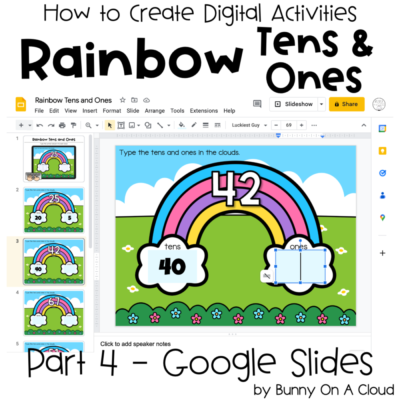
Click on the Text box icon, then click and drag somewhere in the rainbow’s cloud.

6. Select ‘Do not auto-fit’
A height-adjustment icon will appear beside your new text box. Click on it and select the ‘Do not auto-fit’ option.
Text boxes sometimes expands or shrinks depending on the number of characters being typed in them. In this case we want the text box to stay the same size no matter what students type in them, and selecting ‘do no auto-fit’ will fix that.

7. Resize the text box to fit nicely in the rainbow’s cloud.
After selecting do not auto-fit, you can now freely resize your text box. Move your cursor to one of the corners and start resizing it.

8. Change the fill color of the text box
Without fill color, students won’t be able to see the text box there. The fill color hints at them that there’s something to be done there.
So with the text box selected, click on the color bucket tool. The given colors there are not great, so click on the ‘+’ sign under ‘Custom’.
A new box will pop up. You can move the sliders and click on different positions in the color map to experiment with the colors.
In this case I’m just going to type in the color code (#E3F9FF) of a light blue that I already use. For more on color codes, see my PowerPoint tutorial on using colors.
An alternative option would be to add a border around the text box.

9. Set the font, font size and alignment
The font, font size and alignment tools are all found on the 2nd layer of toolbars. You can only use Google Fonts on Google Slides, and there are A LOT more Google Fonts than just the ones in the given list, so click on ‘More fonts’ to browse them.
In this case, I’m going to use ‘Luckiest Guy’ again like I did in Part 2, at font size 69, and with the alignment set to center.

After clicking on ‘More Fonts’, you’ll see something like this… If you already know the name of the font you want to use, you can just type its name, otherwise just explore the options.

10. Add a 2nd text box in the other cloud
We need 2 text boxes on each slide, so after you have set everything right for the first text box, copy and paste to create a 2nd one. Position both neatly in the rainbow’s clouds.

11. Copy and paste both boxes into every slide
With the first 2 clouds in place, copy and paste them into every slide. The text boxes should be pasted right where you want them to be automatically.

12. Run through the entire activity to make sure everything looks great
Now that everything is set, complete the activity as a student to make sure everything looks right.
Unlike TpT Easel or Boom Cards that have a Preview option, after testing the activity, you have to manually delete/undo what you’ve typed.

13. Rename the Google Slides
Once everything is good, rename the slides and the activity is complete!

Next Steps
With the activity part complete, now consider
- adding an Instruction Card to the beginning of the activity
- creating Cover Images that you can use when listing your activity on TpT or Boom Learning
- creating a Product Preview to show your customers more details about your resource
- creating the Final PDF (containing links to the activity) that customers will receive when they purchase your product
You may also want to create this activity in TpT Easel or as Boom Cards if you haven’t already.
For more inspiration on the types of activities you can create, go to How to Use Clipart!


